Companies must constantly assert themselves in a digital world full of competition and change. The website plays a central role in this - it is not only the company's digital business card, but also one of the most frequently used sources of information for potential new customers.
It is obvious that companies need to invest resources in maintaining this page so that it remains up-to-date and the right users come to the website, stay and also convert. But when should a company consider relaunching its website and why? Up to what point is it worth optimising an existing website and when should a new launch be considered?
In this blog article, we report exclusively on our relaunch of the website www.arcmedia.ch. We show how we managed to triple our user numbers within six months and significantly increase our visibility on the web.
Challenges before the new website
The requirements for a modern and functional website are constantly changing. An insufficiently flexible and scalable backend, an outdated design and an outdated website structure presented us with new challenges time and again. With a lot of creativity and pragmatic solutions, we kept our website in good shape. However, stagnating improvements in organic visibility and user engagement meant that we were no longer growing as we had hoped. Efforts to optimise our website for search engines almost all came to nothing.

Image 1: Our Arcmedia website before the relaunch
So we asked ourselves a central question: Is it worthwhile to optimise the website with additional (development) effort or should we not plan a relaunch and thus also renew and modernise our general appearance?
The decision in favour of a new website
How did we decide that the time had come for a relaunch? We assessed our website based on the following questions:
- Condition of the current website: technical problems, responsiveness & speed, user experience and design
- Goals and requirements: Conversion rates and achievement of business goals; scalability and flexibility for future growth
- SEO and competition: SEO performance and ranking in search results as well as comparison with competitors and market trends
- Costs and time frame: Cost and time required for optimisation or redesign
An analysis of the above points based on real figures and evaluations (including benchmarking) showed us that we needed to relaunch the website in order to position ourselves correctly in the market in the future
In the course of the relaunch, we also had the opportunity to modernise and renew our corporate identity and corporate design (CI/CD). This was an additional factor that reinforced our decision.
Planning and development of the new website
The first big step had been taken - the decision to launch a new website had been made. A website relaunch brings with it many challenges. We are therefore all the happier that our internal teams can draw on experts from all the specialist areas required for such a web project:
- Consulting and strategy
- Project management
- User Experience and Design
- Development
- Digital marketing (incl. search engine optimisation)
A detailed concept and detailed planning are essential for the success of such a website project. When will what be done? What are the consequences of the individual steps? And who is responsible for what? Thanks to our many years of expertise, we were able to successfully complete the project within the predefined time frame. But how did we manage this? Below we will guide you through the steps we took.
1. Audit of the existing solution
The existing website was analysed using real figures and insights in order to better understand the users. What content is important and should not be missing on the new website? Where is the user experience poor and where do users abandon their website session? Based on these analyses, the first goals for the new website have already been defined.
2. SEO analysis and keyword research
Understanding what potential customers are looking for - this is the aim of an SEO analysis. As part of this SEO analysis, we scrutinised and updated the target group definition. A detailed analysis of the competition also provided us with helpful input and ideas.
In a second step, we researched and evaluated possible search terms. For which keywords do we want our website to appear at the top of the search engine results in future? Which search terms are irrelevant for us and therefore don't need to be considered? Once we had completed the keyword research, we set about structuring the website together with the UX and design team.
3. User-friendly structure and navigation
Based on the findings from the previous steps and further analyses such as benchmark testing and usability analysis, personas were defined and the customer journey map created. Together with the experts from our UX and design team, we then defined the structure of the new website.
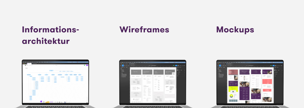
Four UX concepts were applied to ensure the success of the new website. Using an elaborated information architecture, we were able to focus on the structure and navigation before using wireframes to focus on the layout and placement of the content. Thanks to the mockups, everyone in the team was able to visualise the visual design and aesthetics of the new site and categorise it accordingly. Several rounds of reviews were carried out to ensure that the proposals would also be successful in the future. Finally, the user-friendliness and functionality of the site were tested and validated using a prototype.

Image 2: Visualisation of the UX and design process
Together with the digital marketing team, meaningful categories and menu items were defined that can be easily understood and interpreted by both users and search engines.
4. Design a virtual world of experience
We want to offer our customers a unique digital experience. That's why it was important to us that the visual design is also appealing and inspires the users of our website. As with all our web projects, our design team took a step-by-step approach:
- Reworking the general CI/CD of Arcmedia
- Creation of the homepage (various devices) – the final design style is determined here
- Application of the design style to all pages

Image 3: Visualisation of our new CI/CD concept
The design work is always based on the previously defined UX concept. During and especially between the various steps, feedback rounds were always scheduled to incorporate adjustments and improvements.
After the design was approved, we started development and content creation in parallel.
5. Development according to the latest technological standards
Our website was developed on the basis of "Drupal" technology. Particular attention was paid to the following points:
- fast loading times (reduced codes)
- mobile optimisation (responsiveness)
- optimal crawlability by search engines
Every development step was carried out with the goal of an SEO-optimised and user-friendly website
6. Create relevant content for our target group
The SEO-friendly structure, layout and design of the website were finalised. The site was under development and a no less important step in the relaunch project followed in parallel: creating the content.
The aim from the outset was to create relevant, informative and appealing content for our target group. Researched keywords were to be integrated into the text in a natural way so that our site would be positioned particularly high in the search engines for these search terms. In addition to knowledge articles (such as blogs), we also created product and service pages and integrated contact options.
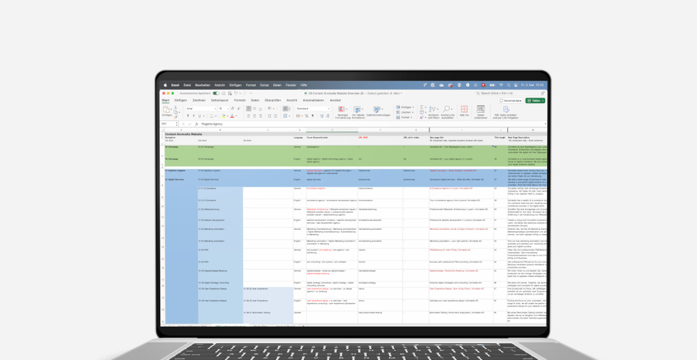
Content includes not only text, but also images and graphics, image captions, call-to-action button labelling, links and so on. In order not to forget anything, we worked with an Excel document that combined all requirements in one document.

Image 4: Visualisation of the document we used to create SEO-optimised content.
Meta data such as title and description as well as a clean URL structure are particularly important and should not be underestimated. The optimised naming of the images, the size of the images and the alt texts also have an impact on search engine optimisation. A well thought-out internal linking structure is essential to make navigation easier for users and to direct them to relevant and informative content.
The content could be published directly in the backend in the elements provided for this purpose.
7. The testing
The website is up and running and the content has been added – apparently the right time to publish the website. But beware: there's no way around extensive testing! Not only should the texts and images be checked, but the functionality of the website should also be scrutinised. Are all pages linked to each other and are there no "dead" links? The testing should not only take place on one device and in one browser, but in all possible settings. The feedback was collected by the various teams and discussed and resolved in the respective feedback rounds.
The launch of the new website
The website was ready to be launched. But to make the go-live a success, certain preparatory work was necessary:
- Redirection of the old URLs: The 301 redirects ensure that existing SEO rankings and backlings are retained
- Setting up the tracking setup: Hotjar, SISTRIX and Google Tag Manager (GTM) were integrated to measure the performance of the website right from the start. Google Analytics, Google Search Console and Google Ads were integrated using GTM.
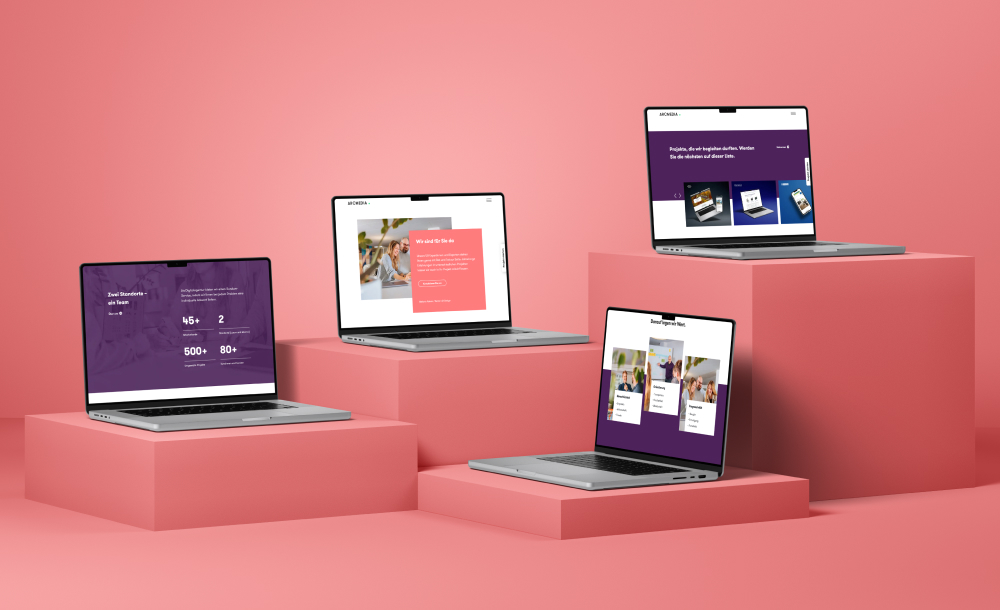
Now everything was ready to publish the website. The relaunch of our website was accompanied by targeted marketing and advertising measures such as newsletters and social media. Shortly after going live, we were delighted to receive the first positive reactions from our customers.

Image 5: Our website after the relaunch
Impact on the number of users
Thanks to our tracking concept, we were able to compare the development of the number of users before and after the relaunch. After around six months, the pleasing conclusion:
Within six months, the number of users on the website almost tripled.
This is primarily due to the improvements in organic search engine optimisation. The number of impressions (organic) also tripled in the same period. The number of clicks (organic) also doubled.
The optimised new website also had a positive impact on paid campaigns (e.g. Google Ads). The quality factors increased significantly thanks to the improved user-friendliness and optimised texts, which in turn led to lower costs per click.
Arcmedia is more visible for relevant search terms and can keep up with the competition in terms of positioning. The visibility of the company website has visibly and noticeably increased. The number of leads generated also reflects the upward trend.
Reasons for the success
There are various reasons that have contributed to the success:
- Technically optimised website (on various devices)
- Content is easily accessible for search engines and relevant for our target groups
- The revised CI/CD gives Arcmedia a modern look and also helps in marketing, for example in the area of brand awareness
- The structure of the website and the simplified navigation allow users to spend more time on our website
- Contacting us is easier and less complicated
- Paid campaigns can be optimised in a targeted manner and thus contribute to more conversions
All in all, we can look back on the website relaunch with pride. We have already achieved the goals we set ourselves within the first six months. And there is still no end in sight
Outlook and future prospects
A website project is never completely finished. The next steps were already discussed during the go-live: What should we tackle next? Where is there still room for improvement?
We monitor our website both on the technical side and in terms of user-friendliness. To do this, we use real figures such as those in Google Analytics. If the figures show any anomalies, we get to the bottom of them and try to improve or adapt the site accordingly.
The website is an ongoing project and we look forward to continuing to present our digital business card as a digital world of experience in the future.
Conclusion
The successful relaunch of our website has shown that well thought-out planning and implementation are crucial to increasing visibility on the web and boosting traffic. Through a combination of technical optimisation, appealing design and targeted content, we were able to significantly increase our user numbers within a short space of time and also improve our positioning in search engine results.
Our tips for you:
A website relaunch is a challenging but rewarding way to strengthen your online business and keep pace with the ever-changing demands of the market. With a strategic approach and continuous optimisation, you can ensure the long-term success of your website.
- Analyse the current status of your website thoroughly. Identify technical problems, optimisation potential and the needs of your target group.
- Set clear goals for the relaunch and define the requirements for the new website. Take aspects such as user-friendliness, search engine optimisation and scalability into account.
- Work with a multidisciplinary team that has expertise in the relevant areas such as design, development and digital marketing.
- Carefully plan the relaunch and create a detailed concept with clear timelines and responsibilities
- Conduct extensive testing to ensure that the new website works flawlessly and provides an optimal user experience.
- Keep an eye on the performance of your website even after go-live and continuously optimise based on data and user feedback
Do you need support? We would be happy to advise you in a free initial consultation.


